Showing posts with label P1. Show all posts

Monday, 10 May 2010

Class art

Some art is almost priceless, as is this portrait by Gustave Klimt, and is the most expensive in the world, sold for a reputed $135. wow
Not only is it the colours, the luxurious gold, like a shower flowing, the black hair and red lips, it is also the pattern on her long flowing dress, the abstract patterns, there is just so much going on. Amid the ornate and colourful background, the subject's face and, in particular her hands, stand out from this extraordinary show of gold. From this we can see that the subject conveys a confidence. This piece of is considered as we know it today as Art Nouveau, with Klimt at this time stretching the boundaries.
Also your eye keeps going round and round. the pose is quite extraordinary as well.
The subject is Adele Bloch-Bauer.

Sunday, 4 April 2010

Martin Elliot Photographer


Martin Elliot
Sadly, Martin has died recently at 63 after a long battle with illness.
Martin Elliot is the photographer who created one of the most iconic images in 1976 of the 70’s Athena’s Poster of the “tennis girl”. This images shows his then girlfriend(18 year old Fiona Butler) with her tennis skirt hitched up to show the curve of her bottom. This image is still being bought today, which shows some images have universal appeal across the years. And even in recent years he was offering signed copies for £300 through his own website. He only took one roll of film, and stated that this was not enough for a professional photographer!
Elliot retained the copyright of the image and made a fortune. But Butler, who had to borrow a tennis skirt, racket and balls, did not make a penny; although she did go on to marry a millionaire.
For the photographer, the early breakthrough was as much a curse as a blessing. He always complained that he could not get commissions because his clients assumed that as the creator of one of the world’s most famous images, his services would be too expensive.
I have not thought about this sort of comment being made about a well known photographer, this aspect needs more research. Would you pay more to use an iconic photographer? How far is this true for all well known photographers?

Tuesday, 30 March 2010

Irving Penn Small Traders


Irving Penn Biography (1917 - 2009) – Small Trades.
American photographer noted for his sophisticated fashion images and incisive portraits.
Last Monday I discovered Irving Penn’s little-known portraits of anonymous street traders, taken in Paris, London and New York between 1950 and 1951. I remembered an advert I had seen in a magazine for Penn’s work, but could not remember where it was. But, thanks to the staff at the Barbican I found that the Hamiton’s Gallery was displaying Penn’s ”Small Traders”. I had not come across this part of his work, but how fascinating.
These images have not been seen in the UK, but the Hamiltons Gallery, speaking to Charlie, they have been involved with the Penn studio (now the Foundation since his death) for 25 years.
They were taken over the period from 1950 to 1951, in New York, London and Paris. These images are depictions of skilled street traders (jobs not available in most cases now), and include a Parisian cheese-seller, a locomotive Fireman in London and a Deep sea diver in New York. They are very different to the Penn exhibition currently at the National Portrait Gallery, which are also in Black and White.
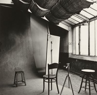
He has posed the tradesmen with their tools and implements of their trades, against a neutral background. He also used a similar technique when he was travelling to Peru etc. Did he take the same background with him? This is a different way to take portraits, which until I saw this I was unaware that this is the sort of thing I am attempting in the studio this time round. The pose is very simple, as is the lighting. This seems to come from one direction, but uses his favourite North light. There is however a clue in the image of his studio in Paris in 1950. The poses are very simple, and each subject is treated in exactly the same way, and portrays the subject in a good way, and my favourite that I saw in the collection was the Milkman. He has a wonderful, almost bemused, expression on his face, and it goes with his pose. Each subject was asked to turn up dressed with their work clothes, except the subjects in New York who apparently turned up in their Sunday best, and were sent home to change.
Apparently, he fitted these portraits sessions around fashion shoots and celebrity portraits, with the studio often littered with couture dresses. The results are very interesting, and you do have to look at them, and the prints are superbly presented at the Gallery, but then for between £75 and £250 K they should be.

Tuesday, 2 March 2010

1st Studio session

L3
Here they are Steve, my first attempts, with some alterations to originals. I found that the subject was too close to the background, which has not come out black. Should have stood further back to bring Brent away from the background to achieve this. (crit by my son on this). Mr Steve pointed out that he felt the eys were not in focus on most of the shots. I don't know if they are here or not. I was using the college 5D, so a joy there, but had to get used to it.
Anyway, comments most welcome as to the technique and lighting please. Mr Steve has given me pointers in as much as to make my mind up what I want the viewer to see in my portraits eg golf club or person! Does this work as the club points to the subject in that image? I did use the snoot and the main light as well as the barn doors(separately of course).
first go image
original image with barn doors
B & w version with contrast adjusted, cropped and golf club added from better lit shot! on the club! Mr Steve says duel lighting is several steps forward of this lighting set up! ie using more than one light.
original image, with reflector to the left, with barn doors 40 degrees to right
crop of original to lose the "pinky". Had to get the light under the hat.
straight B & W conversion, needs contrast adjustment
This is getting better, contrast added and cropped further.
attempting a more fuller portrait, with barn doors.

Monday, 15 February 2010

Statement of Intent

This session on my level 3 course I have decided to choose the studio option. I would like to take portraits and products, and my first theme is based on taking portraits of people, and for my second theme to photograph something that they use in their lives. I am looking forward to learning the techniques of studio lighting, and being able to control the levels and direction of lighting.
It is more or less a lifestyle section, as the object will relate to the person to the objects that they use in their lives.

I have to invite various people to the studio at college to paparticipate, and some I will be able to invite to my home as I can borrow some lighting equipment. Some people I feel will be happier with me doing this, and it will be More convenient for them as well as not everybody can make a Saturday morning.

My intention is to create portraits according to the personality but with low key lighting, with them as far as possible participating in or related to a part of their lives, Irving Penn and David Allen Brent in particular. The other inspirational photographers have been the surrealists, such as Man Ray and Lee Miller (who I really enjoy her image and the reasons behind them).

With the products I will study various photographers and brochures to see how they are represented. Using studio lighting to emulate some of the work by Irving Penn and Steve Chong.

I will be using my own camera consisting of mt Canon 400D with 18-55mm standard lens, and my canon 75-300mm lens. All images will be downloaded to my laptop. This gives me adequate range for both the portrait and product sessions.I do propose to capture the image in the camera as close as possible to elimate time spent using photoshop, but will not eliminate the use of.

My intention is to produce mounted prints, but will make the final decision at the end of the session.

Wednesday, 3 February 2010

David Bailey Stuff

DAVID BAILEY – PHOTOGRAPHER

A while back David Bailey destroyed a lot of his negatives, but some were retrieved by a neighbour, although a lot were lost. He is not the first photographer to do this deliberately, and will probably not be the last. David Bailey gave up photographing for some time, but was persuaded back into taking photographs again. I have included an image of Bailey with a mobile phone containing a camera, and of course, he was famous for advertising cameras. I have included one of his latest image, being the one of Euan McGregor, so he is still producing works.

David Bailey was one of the forerunners in changing the style of photography in the 60’s, and photographed many of the famous appearing at that time, both in fashion and music. Eg He teamed up with Jean Shrimpton and looked all over New York searching for locations that reflected the dynamism of the city at that time.

It is almost inevitable that someone like Bailey, and the recognised photographers form the 30’s onwards, that he worked for magazines such as Vogue. In fact, his career took off while he was a photographic assistant at the John French studio when he was contracted as a photographer for Vogue magazine.

They seemed to have created a stream of photographers over a long period of time, which has allowed likes of David Bailey to create and influence all those that have followed that period. This period was also the era when there was similar ground breaking work in advertising, again allowing great scope for the likes of Bailey to be creative and different.

He also had some controversial images as well, the best known being that of the Kray twins. This is another exquisite image by Bailey, he's taken a famous person (Jack Nicholson), got him into a fun pose, but only that controlled the light extremely well, to really mould the face. This is another key feature in Bailey's photographs. With his photographs of men he usually uses strong directional lighting, to pick up every line about the face, and gets them to pull strong fun poses. With women it is usually softer, less harsh lighting, to really give a soft, beautiful look to the skin. I shall post two more pictures below to emphasise this, the second being a self portrait by Bailey, which is just an excellent image of himself.

David Bailey first took up photography when he was in his national service with the RAF, after the appropriation of his trumpet, he looked for other creative outlets, and bought a Rolliflex camera. Later he was determined to follow a career in photography and also bought a Canon Rangefinder camera, and he became a second assistant to David Ollins.

Saturday, 30 January 2010

L3

Books that I have read and used.

These are some of the books that I have looked at and read through and have made some notes.

1. Shooting and Selling your Photographs by Jim Zuckerman

Published by David and Charles 2003

This is a typical book that can be found many shelves, with good reason. No matter how confident or knowledgeable you are, you may still need to refer to other sources for inspiration and clarification. It also leads to keep asking the questions, and supplying some answers to keep you on track.

Perhaps not so typical but this book is relatively up to date. The chapter titles are:-

  • Are you ready to turn Pro

This chapter invites you to evaluate your photographs and compare them to Pro photographs. Tips given are to examine your images to see if they are technically superior, eg examine them with at least an 8x loupe (magnification), and ensure they are sharp where you intended them to be. Check the compositions are strong and dramatic, and the depth of field is as you require. Are the backgrounds complimentary, or are there pro techniques that can further improve my images.

The advice is that there are 5 immediate steps that can be taken to improve your images. Choose interesting and dramatic subjects, use dramatic lighting, think as the lens see the subject, pay attention to the background and juxtapose colourful subjects. A very important point made is to examine your motivation, especially with the difficulties photographers experience today. 

  • Finding subjects that sell

Below are some examples to think about:-

Brilliantly coloured butterfly vs. dull brown one- unless for record purposes

Graphic, gnarled tree vs. tree with tangled branches

An S-curved sand dune vs. low dunes punctuated with shrubs

A baroque cathedral interior vs. an unadorned chapel

A portrait of an old women with a weathered face vs. middle-aged women with uninteresting face

 A rhino drinking at a waterhole vs. a waterbuck drinking

The grand palace in Bangkok with fireworks vs. City Hall in California

 A Roseate spoonbill vs. a robin

A portrait of a painted face vs. a normal portrait 

An egret displaying vs. and egret not displaying

Income is directly proportional to the impact of your photographs. Travel, research, patience, ingenuity and lots of time are often required to take these images.

  • Choosing a film format digital vs. film

I think this argument these days is over with regard to 35mm. With the bigger formats there is valid reason to consider film over digital, more so as perhaps there is a restriction on the size of the larger formats digital capability.

  • Building your image

This chapter covers headings such as:-

Making an inexpensive portfolio

Selecting portfolio photographs

Fine art

Stock photo agency

Advertising agency

Magazines

Calendars/posters/greetings cards

Direct mail campaigns

Press releases

  • Establishing yourself on the Internet

This covers sections such as :-

Designing your web site

Using a template web site

Advertising your site

Prints for sale

Transmitting your prints

  • Selling your work at Art Shows

Selling direct to the public is another way of displaying and advertising your work.

  • Stock photo agencies

This has become an interesting field with the advent of digital photography. This chapter explores the changing world, prices, model releases and the joining of stock agencies.  A valuable chapter when you are first starting out.

  • Identifying markets for your work

This can either be assignment work or for stock. Face to face meetings with prospective customers can be daunting, so you need to be prepared for these opportunities. What sort of photographs are you interested in will make a lot of difference. If you are interested in the subject then your images will be much better. There is a publication called “The  Photographers Market”, which lists leads for images. Use of bookstores, libraries , mailing lists and the internet are all valid markets.

  • Anatomy of a submission

This chapter covers how to submit your images, which will have a great effect on the acceptance of you work. Cover letters, the photographs, CD’s and the packaging all come into play in this section.

  • Self-publishing

This compares using a graphic designer or doing the work yourself. There is an argument for both approaches, and will depend upon the project ,and who is paying for it! Distribution also has to be considered. How to present the final product also comes into play.

2. the human FACE – Brain Bates and John Cleese

Published by the BBC Worldwide Ltd

This book was produced on the back of a TV programme, and is a mine of information. The chapter titles are:-

  • Origins

This explores the origins of the face you see in the mirror every day, from it’s fishy beginnings, and explores the various evolutionary types through to the apes and man. It explains how the diversity of shapes of face have come about. It also covers the main features of animals and humans etc from bones to skin to hair and eyes, and all the other features.

  • Identity

This chapter explores where our looks come from, and why male and female features are different. It also explains the ins and outs of recognition, of ourselves and of others. Interestingly, it shows how we don’t recognise a line drawing of a person as opposed to an image.

  • Expressions

This chapter explains how our expressions work. It shows, for instance, that women’s facial muscles are smaller than men’s are, and their facial fat hides them better, yet women are more facially expressive overall.

  • Beauty

Beauty is the eye of the beholder. But do we believe it? This chapter explores this concept. It covers faces from different continents. The age, and sex, of the person makes a difference in how the photographer takes his photographs.  This is important to the photographer when he is making his images, and what the photographer is trying to portray. 

  • Vanity

This chapter explores the way we look at ourselves, and how we groom and look after ourselves, and it is the photographer’s vision that will create the image he sees. It also explores the story of make-up, which can be very important when creating your images. Also markings on bodies is discussed, eg tribal markers, different continents have different ways of expressing themselves.

  • Fame

This chapter deals with why we recognise people and faces. This is because of the media levels and advertising that goes on today. It also refers to days gone by where statues etc were erected which gave wide recognition to prominent people. Faces of the famous, and not so famous, and you and I, carry more detailed, visible “information” than other parts of our body. Nowadays, photographs abound everywhere depicting people’s faces, from posters to publications of many varieties.

  • Conclusion

The human face is a dynamic structure, changing over evolutionary time and in our own lifetime. Identifying with our face means we tend to take it for granted. When we look in the mirror, many of us do not see a clear image. It is up to the photographer to bring out the character of the person, the structure etc in a way that enhances the subject.

3. image makers, image takers – an essential guide to photography by those in the   know by Anne –Celine Jaeger.

Published by Thames & Hudson 2007

This is an interesting book and layout, and shows selected images, along with a brief question and answer form the selected photographs. The first comment made at the beginning is a quote from Ansel Adams (always good for a quote) ‘YOU DON’T TAKE A PHOTOGRAPH, YOU MAKE IT’.  This comment is more prominent now due to the digital revolution since Adam’s day. There are no chapters as such, just a collection of a few outstanding photographers grouped together under various headings, in parts. This are:-

Part 1-Art, Documentary, Fashion and Advertising, Portraiture, Next Generation. This is a list of photographers only.

  • Art

Thomas Demand, William Egglestone, Boris Mikhailov, Stephen Shore.

  • Documentary

Mary Ellen Mark, Martin Parr, Eugene Richards, Sabastiáo Salgado.

  • Fashion and Advertising

David Lachapelle, David Sims, Mario Sorrenti, Ellen Von Unwerth.

  • Portraiture

 Tina Barney, Anton Corbijn, Rineke Dijkstra, Rankin, 

  • Next Generation

Charles Fréger, Naoimi Harris, Alec Soth, Neil Stewart

Part 2 – Curators and Gallerists, Agency Directors, Editors and Publishers. This is a section describing why they have chosen certain photographers, and the list is 

  • Curator

Camilla Brown-Senior curator at the The Photographers Gallery. 

Katherine Hinds- Curator of photography at Margulies collection at the Wharehouse, Miami.

Dr Inka Graeve Ingelmann-Head of Photography Pinakothek der Moderne, Munich.  

  • Gallerist

Rudolf Kicken-Founder and co-owner gallery Kicken, Berlin.

  • Agency Director

Diane Dufour-Bureau Chief, magnum, Continental Europe.

  • Picture Editor

Kathy Ryan-Picture Editor, The New York Times Magazine, New York.

  • Publisher

Gerhard Steidl-Founder and Publisher, Steidl Publishing, Gőttingen

Dan Torres-Picture Editor, Libération, Paris.

.

4. The photographers Guide To using Light - by Ted Scharz and Brian Stoppee 

Published by Amphoto 1986

The chapters are set out in a logical order, and are well supplemented with photographs showing the effects of various characteristics and manipulation of light. The book is split in to two parts, Understanding Light and Using Light. Part 1 is split into 4 sections, Sunlight, Existing Light, Supplemental Light and Electronic Flash. Part 2 has 16 sections, ranging from using natural light, working with the weather, bringing the outdoors in, mixing light sources, internal lighting setups and specialized lighting. The chapters are 

5. Master Lighting Guide for Commercail Photographers – by Robert Morrissey

Published by Amherst Media 2007

This book is set out similar to the one above, but is in three parts, but set out somewhat different.

 Part 1 covers

 a)basics of lighting, ie types of light, characteristics and exposure for aperture, speed and metering.

b) Equipment, including cameras and flash units.

c) Understanding the diagrams in the book, quite simple really.

d) Studio setup including a product table and sets

Part 2 covers

Using lights and modifiers, eg umbrellas, softboxes etc

Part 3 covers the creative approach

This is the most extensive part and covers over 50 pages as opposed to 4 or 5 for each section. The photographs and  diagrams illustrate very clearly the effects of the changes in lighting rigs, and covers items such as lens flares, using mirrors, using different props etc. It also covers the problems interiors can produce, and offers solutions for several situations, which is quite useful in allowing the photographer to design his lighting for his photographs. The illustrations also show the power levels that were used to take the image, which a lot of similar books do not do, so this book gives a good steer towards a photographer setting up his lighting rig.