Showing posts with label Photographers. Show all posts

Monday, 31 May 2010

59 Rodney Street, Liverpool

I went to Liverpool yesterday, 30th May 2010, with the express intention of visiting this studio at 59 Rodney Street, Liverpool. This was the last home and studio of Margaret and Edward Chambre Hardman, and is the only known British studio of the mid-20th century where the photographer's entire output has been preserved. It is now cared for by the National Trust.I had booked a tour(only 6 people at a time) and a whole new world was opened up. There currently is an exhibition dedicated to Margaret, which is quite unusual. You can see virtually the whole extent of the areas in which they worked, which have been carefully preserved (under NT conditions), but the staff are brilliant and knowledgeable, and the displays are good. But, when you get into the small darkroom that they used for their personal work you get the overwhelming feeling of the joy that they had in creating their work. It makes you want to do the same. They even play the music that they had in the room. Hanging on the walls are things like his mask for clouds for the Landscapes they enjoyed, and his other dodging tools for example. I was there for 3 hours, and you can take photos inside, but it is quite dark and flash is forbidden.


This is the exterior, and also shows the basket of flowers they put up so that they would be easy to find in the street. Note the 2 plaques each side giving the name of the studio. This is an elegant street.


This image shows the garden and rear of the property, also the balcony where the 2 of them used to breakfast, and has a great view of the Anglican Cathedral. The building has been extended 3 times, but this was done prior to the Hardmans buying the place in 1949. There are still 2 rose bushes in the garden that they used to have.


This is the chair that the majoity of the sitters would use. You can just see the edge of the tray of tea that was also offered to the sitter/s. Part of the reason was to relax the sitter, but also to moisten the lips, which would then photograph better. This chair was slightly elevated on a small dias, and for this shot was lit by one of Hardmans actual lights. His electrics were somewaht chaotic though, and all lights were operated from one 2 pin socket!!!!!!! When the NT dismantled the kit the wall was very burnt, but no recorded fires have been found!


This image shows the area where the retouching of the image was done. Positioned very near the window this would have been a very delicate process. This area was also a very busy where the staff took tea braeks, chatted etc, so the person had to really concentrate when touching up the photographs, as this was done "longhand", not in photoshop. Mistakes could not be rectified.


These are boxes of film that Hardman recovered from the radiographers next door, who were throwing tham out, to store his prints and other papers in, and fill many shelves in the mounting office. A wonderful room where all the prints were packages etc.

Friday, 16 April 2010

Steve Chong

 Steve Chong - Conceptual and Still Life Photographer. born 1965-started Photography 2001
His photography started by taking images of his home town for his homepage on a point and shoot camera. He decided that they were not good enough. Thus began his interest in photography. He read all he could and after reading the series by Ansell Adams, this is where his smouldering passion for photography took off.
He bought an entry level Canon EOS/88 but soon upgraded to a EOS/1V and lenses. A year later, after much experimentation, he found a comfortable niche in Conceptual and Surrealistic photography. He enjoyed creating an idea and seeing it materialise. he states that "it is like pointing a camera into the real world, but shooting form his sub consciousness".
After realising that scanning images was taking too much time, he boughta digital Sigma SD9 and lenses. He also liked the quality produced by the medium format camera, so went out and bought a Mamiya RZ Pro II with a fish eye lens, a 90mm and 250mm lens.
He ahs gone on from these early beginnings to photograph a wide variety of images and subjects, from landscapes to portraits, documentary to Urban, along with his conceptual and surrealistic images.
he now gives talks and demonstrations around the world, and alos has Exhibited his work widely. In June 2009he obtained a distinction in the Visual Art Category with the ARPS. he ha scome a long way in a very short time, and his Blog contains a large variety of subjects.
His motto is" it is not what you see, it is how you see it", which I think is a good way of describing photography.


This is an example of his conceptual and surreal imagery. This is entitled "Illusion", and is a very clever play on light and is quite surreal. the lighting is quite spectacular to illustrate the desert like feeling to this image.


This is a good example of how to make a good image from an everyday product, with simple natural lighting and composition.The leaf shows the use and the shadow clearly adds to the composition.  Steve Chong says -"As I was strolling this morning, the rake leaning on the wall really caught my attention. I find it mesmerizing when I saw the shadow of the rake created by the golden morning ray of sun. The leaf stuck on the rake was a bonus. So I ran back home, got out my gear and took this shot."
This shows excellent lighting to illustrate a product in use.The lighting on the bubbles shows the many rainbow colours you get from the source of the bubbles. It seems that there are two light sources in action here, one plain on the girl, he other highlighting the bubbles.


The combination of colours here are classic, but the use of them to produce this image, from original item to final item in one image is an excellent interpretation. The direction of the lighting enhances the overall feel for this image.
Such a simple abstract pattern with composition being the main part of this image. It also conveys the anticipation of what is to come.
I am not sure what this is but I can see that it is abstract, and the shape of the liquid almost seems to form a golf club. The texture of the liquid is well represented as it evidently does not flow like water but is a more thicker liquid which forms this shape. The container also looks surreal as it appears to have no edges.
A very good play on subject matter. The lighting is quite dramatic across the image, and picks out the elements very well. The view point is at a level to which we can see all the action.
Another simple composition, with a combination of lighting. the candle lighting the interior, and the external directional lighting emphasising the shape of the product. This is very pleasing on the eye, very relaxing.
This is similar to the golf image above, but the lighting is even more dramatic.
This is entitled "Anticipation". The lighting again is quite clever to get an even spread over the image so that all is very well lit.

This is entitled "me and my shadow" and is a very simple composition and the objects sits very nicely in the top corner. The colour chosen is very easy on the eye and with an even shiny surface gives that wonderful shadow. With the one directional lighting this enhances the product shape and size.Light source was derived from my computer monitor. Steve Chong says -"I wrote a simple BASIC program to obtain the colors I desired. Interestingly, the surface of the table is pink. I bought the cup during my tour to Vietnam."

This image of the apples is called going higher,and the lighting is very subtle, and is coming from 2 directions. I like to subtle colours, the soft background is a good foil for the red cherries. Steve Chong says -"Everything in this shot was planned deliberately. The folds on the background and foreground demand the highest attention. In order to get the "right" folds at the respective places, I have to stroke, rub, re-adjust and not to mention blowing air on them. The objective is to create the sort of drama at the foreground and background, particularly on the foreground where they were use to lead the vision the subjects. The fabric at the foreground was silk and normal cotton for the background. To create the sepia look I have chosen a warm filter. The flare and reflections on the apples are eliminated by the use of a polarizing filter. It has also enhanced the colors on the apples." Steve says the light was Natural from a window.
The details for this image are :-Camera: Canon EOS/1V


Lens: Tamron SP90mm

Film: ASA100

Aperture: F3.5

Shutter: 1s

Filter: Polarizing Filter, Kenko 85

Light: Natural Light from window


Just to illustrate that this photographer does not only do conceptual and still life images, this is an image from his Yuan Yang series. The capture of the light here is just remarkable, even more so the lighting on the countryside is very exhilarating.

Monday, 5 April 2010

Alexey Brodovitch


Alexey Brodovitch (1898 – 1971)
He was a Russian born photographer, designer and instructor who is most famous for his Art direction of Fashion Magazine Harper’ Bazaar from 1938 to 1958. He was also Irving Penn’s mentor, and Diane Arbus studied with him.
In 1918 him and some of his family made their way to France, where Alexey wanted to be a painter (the connection again with painting and photography !) He and his wife settled in Montparnasse in Paris, along with other Russian artists, including Chagall. Through this connection he started painting backdrops rather than houses, but at that time Paris was a very cosmopolitan city with lots of arts and artist’s, and he was exposed to everything from Dadism to Bauhaus Cubism and many other influences of that period.
He began to sketch designs for textiles, china and jewellery. He gained public recognition of his work in the commercial arts by winning first prize in a poster competition for an Artists’ soiree called Le Bal Banal on march 24th 1924. This poster was exhibited all over Montparnasse along with a drawing by Picasso, who took second place. He remained proud of this work and kept a copy pinned on his studio wall. The graphic, light to dark inversion of its mask shape, type and background suggest not only photography, but also represents the process of trading one’s identity for another when wearing a mask. After that he was hired to design and illustrate catalogues for the Parisian store Aux Trois Quartiers.
Brodovicth embraced technical developments from all spheres of industrial, photography and contemporary painting. Brodovitch went to America in 1930, and his task was to bring American advertising design up to the level of Europe, and taught advertising students. He would always teach with a visual aid, and were then told to make a “graphic impression” of what they had seen, whether a photographic interpretation, a drawing or an abstraction.(This for me is what I am trying to achieve,partly without realising it, and found someone who has taught like that).
Typically, Brodovitch would begin his layouts by designing the layouts as illustrations by hand. His assistant would receive these sketches to look over, but the photographers and freelance writers were often given little or no direction at all besides to come up with something new and unusual. When the photographs arrived, he would pick the most visually interesting and have a variety of sizes of reproductions made on a Photostat machine ( the old days?). Brodovitch would crop images unexpectedly or off-centre to bring a new dynamism to the layout.
Although not a photographer as such his expertise at design and use of photographs to illustrate an article or a magazine is so important. For example he would arbitrarily take a series of photographs and adopt a story line to go with them. Nowadays we work to briefs to do this. He was known to push this idea even further by adding film sprocket borders to photographs at times (popular now). He is also famous for introducing the photographic double-page spread. This side of photography is very important as it ends up as the end product.

Wednesday, 31 March 2010

Simon Annaurd V&A London

This images almost looks like it is a mask, with the expression on the face giving that impression, I really like the way this image is presented.

This was taken showing the way that the images were displayed in the V&A, which I believe makes all the difference to the way you view images, especially in public exhibitions. the down side is that the public usually obstruct your view!!
A very different view of Kirsten Scott Thomas backstage. The joy of these images by this author is that you see these people in the un-glamourous and normal state, which means I can relate to them in a different and more normal way.

that pre thought before going on stage and whiling the time away waiting for the glamour to come.

Deep in thought, almost relaxed, one down one to go. what is he thinking about, is it the next session, or what is he going to do after, or reflecting on his performance? This makes the image interesting and as a viewer you keep looking, and you can come to several conclusions, as I have noted above.


Simon Annaurd
Whilst at the V&A last Monday I also went to see the Theatre section, for no reason other than I had not seen it before. Well, a treat was in store as Simon Annaurd had an exhibition of photographs there of his work in the Theatre. The exhibition is called “The Half”. The title of the work is based on the 30 minutes that the cast get to settle and concentrate on their upcoming performance on stage. It is a private time for actors/actresses, and as a result the images he has captured are quite remarkable as this part of their lives are rarely captured.
He has had unprecedented access over the last 25 years, and the results are evident in his approach, which is quite intimate in their dressing rooms (not the most glamorous of places when you look at the photos) which is dependent on the actor/actress themselves. This 30 minutes prior to going on stage has rarely been seen by other than those involved and shows a remarkable insight into that world. These images give us the audience an insight into the fascinating workings of Theatre behind the curtain.
On a smaller scale, I have in the past been involved with a touring opera group and can appreciate the difficulty in getting these images. His portraits are quite unusual, and he has a keen eye for detail. And his images leave a lot to study.
I like the informality of the poses, some of the subjects do not even seem to be aware he is there eg Daniel Graig- others have a look that shows the level of concentration that they are in eg Gillian Anderson, whereas Kiera Knightley is apparently looking at the photographer. Others are in conversation, eg Martin Sheen, or is he practising his lines? The interesting thing is you do not really know what is going through their minds at the moment of the shutter clicking, there is a level of intrigue in each and every image. What we do not know of course is how many images he took to achieve the ones selected. These were taken in the age of film, and he started in the late 70’s
I found it difficult to photograph in the exhibition but I did manage to get some, which also shows how well the images are presented in an exhibition. I am intending to purchase his book, as it fascinating to see these images. The stark Black and White I think show the intimacy of the moments.

Tuesday, 30 March 2010

Irving Penn Small Traders


Irving Penn Biography (1917 - 2009) – Small Trades.
American photographer noted for his sophisticated fashion images and incisive portraits.
Last Monday I discovered Irving Penn’s little-known portraits of anonymous street traders, taken in Paris, London and New York between 1950 and 1951. I remembered an advert I had seen in a magazine for Penn’s work, but could not remember where it was. But, thanks to the staff at the Barbican I found that the Hamiton’s Gallery was displaying Penn’s ”Small Traders”. I had not come across this part of his work, but how fascinating.
These images have not been seen in the UK, but the Hamiltons Gallery, speaking to Charlie, they have been involved with the Penn studio (now the Foundation since his death) for 25 years.
They were taken over the period from 1950 to 1951, in New York, London and Paris. These images are depictions of skilled street traders (jobs not available in most cases now), and include a Parisian cheese-seller, a locomotive Fireman in London and a Deep sea diver in New York. They are very different to the Penn exhibition currently at the National Portrait Gallery, which are also in Black and White.
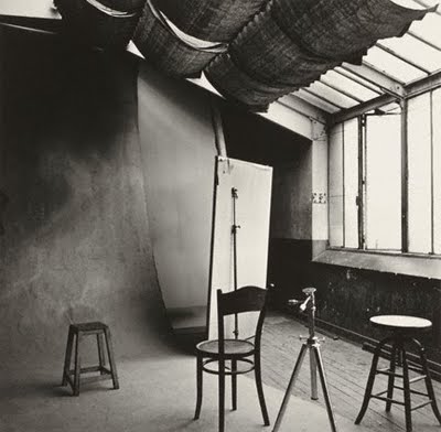
He has posed the tradesmen with their tools and implements of their trades, against a neutral background. He also used a similar technique when he was travelling to Peru etc. Did he take the same background with him? This is a different way to take portraits, which until I saw this I was unaware that this is the sort of thing I am attempting in the studio this time round. The pose is very simple, as is the lighting. This seems to come from one direction, but uses his favourite North light. There is however a clue in the image of his studio in Paris in 1950. The poses are very simple, and each subject is treated in exactly the same way, and portrays the subject in a good way, and my favourite that I saw in the collection was the Milkman. He has a wonderful, almost bemused, expression on his face, and it goes with his pose. Each subject was asked to turn up dressed with their work clothes, except the subjects in New York who apparently turned up in their Sunday best, and were sent home to change.
Apparently, he fitted these portraits sessions around fashion shoots and celebrity portraits, with the studio often littered with couture dresses. The results are very interesting, and you do have to look at them, and the prints are superbly presented at the Gallery, but then for between £75 and £250 K they should be.

Sunday, 21 February 2010

Irving Penn Notes

Irving Penn Biography (1917 - )

American photographer noted for his sophisticated fashion images and incisive portraits.

On our (L3 photography group) day trip to London 20th February 2010, some of us visited the National Portrait Gallery, and the Irving Penn exhibition. Personally, I learnt a lot from looking at his photographs, and had quite a difficulty working out how he had lit some of his images. I know that he used a large bank of lights in his studio for some shots, but I still could not work out how he has lit some of his images, especially the ones where the subject is posed in front of the tall stage flats together to create a narrow corner in which to photograph his subjects. Penn invented this particular backdrop, which became known as the corner.

Once again this photographer started life as a painter, and then progressed to photography, and along the way just happened to pass the time with the likes of Giorgio de Chirico, Le Corbusier, Marcel Duchamp, Martha Graham, Georgia O’Keeffe, Edward Steichen, Jean Cocteau, Joan MirĂ³, Cecil Beaton, Pablo Picasso, Yves Saint Laurent, Susan Sontag, Ingmar Berman, AndrĂ© Kertesz, Richard Avedon, Helmut Newton, basically so many of the many cultural figures it is difficult to work out who he did not photograph. What influence these artists and photographers would have had on each other would have been so wonderful, to live such a rich artistic life. But they all managed to develop the own style, all managed to get published with the art and fashion magazines of the day.

Penn established himself as a fashion photographer and got published in the likes of Vogue, with his own ideas for covers. Penn relied on the manner, attitude and tolerance to represent a subject, and all his images were meticulously set up and photographed to the greatest detail. The subjects must have had a lot of patience to sit there while he set himself up. But this is the skill and importance of the photographer, and the most important part of taking portraits, and being able to judge the sitters personality whilst in front of the camera. I like the bold and contrasting lighting that he uses, but he manages to show every detail in his images. His subjects are placed against a bare backdrop, and the subtlety of this shows also through in his subjects.

I also find it incredible that in his early days he had no control over the images produced, as they were by the magazine. He sometimes did not see his image until it had been published. Did these images match that idea he had in his head when photographing them?

He also travelled quite extensively. He went to Peru in the late Forties for example, where he would employ the same techniques in photographing the local people as he did when in a studio. This allowed him to create and isolate the cultural differences for all to see without any distracting backgrounds. He developed his own portable background, similar to the ones we use today.

Writing about Penn's work for an exhibition at the Museum of Modern Art, the museum's then-Chief Curator of Photography, John Szarkowski wrote, "The grace, wit, and inventiveness of Penn's pattern-making, the lively and surprising elegance of his line, and his sensitivity to the character, the idiosyncratic humours, of light make Penn's pictures, even the slighter ones, a pleasure for our eyes.

What I find most interesting in these images is the consistency. The fact that his technique has been developed from his painting and advertising days is evident, as his technique is so different to his peers. From his portraits, through to his travel portraits and nudes, he has managed to get the personality of his sitter captured. His handling of the backgrounds is very simple and very effective. This is the area that I have concentrated on for this excercise. smoking black and white conceptual Richard Avedon Jacob and Gwen Lawrence 1St cover 1943 Vogue 54 Nicole Kidman Peruvian disaffected Children Francis Bacon Cafe in Lima (how many times do I see a similar image whilst out) Alberto Giacometti Paris 1950 Arthur Miller Trumen Capote
Simone de Beauvoir 1957
Pablo Piccasso
Marcel Duchamp
Mud men Lisa Fonssagrives-Penn 1950
Vogue cover 1950 Guedras in the wind 1971 Morocco