Did anybody catch the "South Africa in Photographs" on BBC 4 tonight at 9pm.
Very very interesting, and was all about social documentary by various photographers over the years, from early days, through apartide and to the current generation.
The narrator was RANKIN, and I thought he could such alot better. He did meet some very interesting photographers, the favorite of mine was the young girl photographing the young men who dressed as they felt like, (and there are some notes at the end for her) not in traditional dress.There were a group of students however who did photograph in the old tradition, of just background. The progamme also covered past conflicts (with the death and injury to some mebers of the "Bang Bang" group of photographers, and finished with a sequence where people were being baptised in a river. The BangBang photographer also made underwater images with an old Nikon, but he generally uses an old Rolliflex film camera, even over the years he photographed the past conflicts, no 35mm camera here.
I am going to have to watch it again to get the names of the photographers involved.
As my themes for this session are based on Lifestyle, portrature and products I found this very intersting as a development to look to for the future.
Nontsikelelo Veleko
Born in 1977, Nontsikelelo Veleko lives and works in Johannesburg. She is a highly original photographer and project manager/co-coordinator at the Market Photo Workshop, where she previously trained in the art of photography. In the last couple of years, Lolo has been gathering a great deal of attention with her striking work entitled Beauty is in the eyes of a beholder. She was a nominee and finalist of the MTN New Contemporary Artists in 2003 and has since been participating in important local and international exhibitions. Already this year, her photographs were exhibited in the landmark exhibition Snap Judgements : New Positions in Contemporary African Photography at the International Center of Photography in New York and in Personae Scenarios-the new African Photography, Brancolini Grimaldi Arte Contemporanea in Rome. Also recently she was participating in well publicized shows like Click at the Goodman Gallery in Johannesburg, or Unsettled, 8 South African photographers in Denmark, Sweden and South Africa, as well as other exhibitions and projects in Switzerland, the United States and of course at home.
These images are a very good example of the lifestyle that some young african are adopting, and one image shows the dynamic fashion shot that she is already taking.
Tuesday, 27 April 2010
Monday, 19 April 2010
Friday, 16 April 2010
Steve Chong
Steve Chong - Conceptual and Still Life Photographer. born 1965-started Photography 2001
His photography started by taking images of his home town for his homepage on a point and shoot camera. He decided that they were not good enough. Thus began his interest in photography. He read all he could and after reading the series by Ansell Adams, this is where his smouldering passion for photography took off.
He bought an entry level Canon EOS/88 but soon upgraded to a EOS/1V and lenses. A year later, after much experimentation, he found a comfortable niche in Conceptual and Surrealistic photography. He enjoyed creating an idea and seeing it materialise. he states that "it is like pointing a camera into the real world, but shooting form his sub consciousness".
After realising that scanning images was taking too much time, he boughta digital Sigma SD9 and lenses. He also liked the quality produced by the medium format camera, so went out and bought a Mamiya RZ Pro II with a fish eye lens, a 90mm and 250mm lens.
He ahs gone on from these early beginnings to photograph a wide variety of images and subjects, from landscapes to portraits, documentary to Urban, along with his conceptual and surrealistic images.
he now gives talks and demonstrations around the world, and alos has Exhibited his work widely. In June 2009he obtained a distinction in the Visual Art Category with the ARPS. he ha scome a long way in a very short time, and his Blog contains a large variety of subjects.
His motto is" it is not what you see, it is how you see it", which I think is a good way of describing photography.
Lens: Tamron SP90mm
Film: ASA100
Aperture: F3.5
Shutter: 1s
Filter: Polarizing Filter, Kenko 85
Light: Natural Light from window
His photography started by taking images of his home town for his homepage on a point and shoot camera. He decided that they were not good enough. Thus began his interest in photography. He read all he could and after reading the series by Ansell Adams, this is where his smouldering passion for photography took off.
He bought an entry level Canon EOS/88 but soon upgraded to a EOS/1V and lenses. A year later, after much experimentation, he found a comfortable niche in Conceptual and Surrealistic photography. He enjoyed creating an idea and seeing it materialise. he states that "it is like pointing a camera into the real world, but shooting form his sub consciousness".
After realising that scanning images was taking too much time, he boughta digital Sigma SD9 and lenses. He also liked the quality produced by the medium format camera, so went out and bought a Mamiya RZ Pro II with a fish eye lens, a 90mm and 250mm lens.
He ahs gone on from these early beginnings to photograph a wide variety of images and subjects, from landscapes to portraits, documentary to Urban, along with his conceptual and surrealistic images.
he now gives talks and demonstrations around the world, and alos has Exhibited his work widely. In June 2009he obtained a distinction in the Visual Art Category with the ARPS. he ha scome a long way in a very short time, and his Blog contains a large variety of subjects.
His motto is" it is not what you see, it is how you see it", which I think is a good way of describing photography.
This is an example of his conceptual and surreal imagery. This is entitled "Illusion", and is a very clever play on light and is quite surreal. the lighting is quite spectacular to illustrate the desert like feeling to this image.
This is a good example of how to make a good image from an everyday product, with simple natural lighting and composition.The leaf shows the use and the shadow clearly adds to the composition. Steve Chong says -"As I was strolling this morning, the rake leaning on the wall really caught my attention. I find it mesmerizing when I saw the shadow of the rake created by the golden morning ray of sun. The leaf stuck on the rake was a bonus. So I ran back home, got out my gear and took this shot."
This shows excellent lighting to illustrate a product in use.The lighting on the bubbles shows the many rainbow colours you get from the source of the bubbles. It seems that there are two light sources in action here, one plain on the girl, he other highlighting the bubbles.
The combination of colours here are classic, but the use of them to produce this image, from original item to final item in one image is an excellent interpretation. The direction of the lighting enhances the overall feel for this image.
Such a simple abstract pattern with composition being the main part of this image. It also conveys the anticipation of what is to come.
I am not sure what this is but I can see that it is abstract, and the shape of the liquid almost seems to form a golf club. The texture of the liquid is well represented as it evidently does not flow like water but is a more thicker liquid which forms this shape. The container also looks surreal as it appears to have no edges.
A very good play on subject matter. The lighting is quite dramatic across the image, and picks out the elements very well. The view point is at a level to which we can see all the action.
Another simple composition, with a combination of lighting. the candle lighting the interior, and the external directional lighting emphasising the shape of the product. This is very pleasing on the eye, very relaxing.
This is entitled "Anticipation". The lighting again is quite clever to get an even spread over the image so that all is very well lit.
This is entitled "me and my shadow" and is a very simple composition and the objects sits very nicely in the top corner. The colour chosen is very easy on the eye and with an even shiny surface gives that wonderful shadow. With the one directional lighting this enhances the product shape and size.Light source was derived from my computer monitor. Steve Chong says -"I wrote a simple BASIC program to obtain the colors I desired. Interestingly, the surface of the table is pink. I bought the cup during my tour to Vietnam."
This image of the apples is called going higher,and the lighting is very subtle, and is coming from 2 directions. I like to subtle colours, the soft background is a good foil for the red cherries. Steve Chong says -"Everything in this shot was planned deliberately. The folds on the background and foreground demand the highest attention. In order to get the "right" folds at the respective places, I have to stroke, rub, re-adjust and not to mention blowing air on them. The objective is to create the sort of drama at the foreground and background, particularly on the foreground where they were use to lead the vision the subjects. The fabric at the foreground was silk and normal cotton for the background. To create the sepia look I have chosen a warm filter. The flare and reflections on the apples are eliminated by the use of a polarizing filter. It has also enhanced the colors on the apples." Steve says the light was Natural from a window.
The details for this image are :-Camera: Canon EOS/1V
Lens: Tamron SP90mm
Film: ASA100
Aperture: F3.5
Shutter: 1s
Filter: Polarizing Filter, Kenko 85
Light: Natural Light from window
Monday, 12 April 2010
Paulo Lorenso Studios, Newcastle under Lyme
PAOLO LORASO STUDIOS
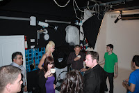
On Saturday Layla said she had a studio session and tutorial on Sunday, and asked me if I would like to go along to learn more about shoots etc. Needless to say no problem for me, hungry for knowledge and expertise.
And what fun and how interesting. So many tips and being made aware of what to look for. Most of it is only common sense, but you can get lost in taking the image as I discovered on Saturday. They are also the official photographers for the Signal 1&2 camera club.
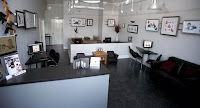
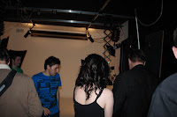
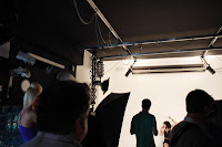
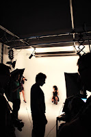
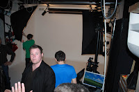
The studio is a professional studio, and is set up to be very commercial. There were 6 photographers in the session, all working and Paolo introduced us to how he runs his business and where he makes his money. He showed us round his studio, the various lighting set ups he has, why he uses certain products etc for example a make of lights. The studio photographers showed us how to use the models in the studio with the various lighting effects, all operated by remote control, for instant changes.
The studio is permanently set up, and is adaptable for many forms of Photography, from single portraits to group shots. He also explained the various revenue streams that he uses to make his business.
We each of us then were given 5 minutes with each of the 2 models (Layla being one, dressed and made up totally different to Saturday, and Christy the other) with 2 different lighting set ups, but this got a bit higglely piggly, but we got there.
It was really useful and very eye opening to see a studio being run. Very relaxed but professional.
It was an experience that I did not think I would have and I am very grateful to Layla for the Invitation.
You can see some of the images here that I took.
Things I learnt are:-
Inkjet printers don't like dust so use in dust free environment
White ink is free(major cost for studio is the cost of ink-price per ml-generally allow twice the cost of paper for ink)
Models usually have a CD not prints because of this-only print when necessary-then usually 10x8.
Keep each area of the studio separate.
Use the best lighting equipment you can buy as this will last longer and work quicker.
Remote control of lighting leads to quicker changes, and turn round for different subjects, makes setting up the lighting really quick.
Using area lighting makes taking of images a lot easier where required.
Calibrate the camera to PC and printer(Spider Pro eg).
If cropping to 10x8 ensure your subject is in the correct frame when taking image.
Talk to the model not the camera
Don't stand on tip toe to take image.
Be very clear with your instructions to the model, talk face to face not through the camera.
When using projected backdrops be aware of any lines forming on the subject.
Check each picture you take, to ensure it is correctly exposed/in frame/composition is correct/enables feedback to the subject/ and you get what you are looking for.
This also allows you to rest your arms and prevents your hands shaking.
Always use a make-up artist, even for outdoors work.
Use of lighting to emphasize any aspects, or vica versa.
I used the studio 1D to take the shots, mainly as I had not used one before, and it was tethered to the PC. The set up was on 2 monitors, one for the photographer and one for the subject to see, but the results where after the shot taken.
The host Paolo was exceedingly knowledgeable and very hospitable and generous with his knowledge and answered any question put to him, with great amusement at times.
Here are some studio shots.
On Saturday Layla said she had a studio session and tutorial on Sunday, and asked me if I would like to go along to learn more about shoots etc. Needless to say no problem for me, hungry for knowledge and expertise.
And what fun and how interesting. So many tips and being made aware of what to look for. Most of it is only common sense, but you can get lost in taking the image as I discovered on Saturday. They are also the official photographers for the Signal 1&2 camera club.
The studio is a professional studio, and is set up to be very commercial. There were 6 photographers in the session, all working and Paolo introduced us to how he runs his business and where he makes his money. He showed us round his studio, the various lighting set ups he has, why he uses certain products etc for example a make of lights. The studio photographers showed us how to use the models in the studio with the various lighting effects, all operated by remote control, for instant changes.
The studio is permanently set up, and is adaptable for many forms of Photography, from single portraits to group shots. He also explained the various revenue streams that he uses to make his business.
We each of us then were given 5 minutes with each of the 2 models (Layla being one, dressed and made up totally different to Saturday, and Christy the other) with 2 different lighting set ups, but this got a bit higglely piggly, but we got there.
It was really useful and very eye opening to see a studio being run. Very relaxed but professional.
It was an experience that I did not think I would have and I am very grateful to Layla for the Invitation.
You can see some of the images here that I took.
Things I learnt are:-
Inkjet printers don't like dust so use in dust free environment
White ink is free(major cost for studio is the cost of ink-price per ml-generally allow twice the cost of paper for ink)
Models usually have a CD not prints because of this-only print when necessary-then usually 10x8.
Keep each area of the studio separate.
Use the best lighting equipment you can buy as this will last longer and work quicker.
Remote control of lighting leads to quicker changes, and turn round for different subjects, makes setting up the lighting really quick.
Using area lighting makes taking of images a lot easier where required.
Calibrate the camera to PC and printer(Spider Pro eg).
If cropping to 10x8 ensure your subject is in the correct frame when taking image.
Talk to the model not the camera
Don't stand on tip toe to take image.
Be very clear with your instructions to the model, talk face to face not through the camera.
When using projected backdrops be aware of any lines forming on the subject.
Check each picture you take, to ensure it is correctly exposed/in frame/composition is correct/enables feedback to the subject/ and you get what you are looking for.
This also allows you to rest your arms and prevents your hands shaking.
Always use a make-up artist, even for outdoors work.
Use of lighting to emphasize any aspects, or vica versa.
I used the studio 1D to take the shots, mainly as I had not used one before, and it was tethered to the PC. The set up was on 2 monitors, one for the photographer and one for the subject to see, but the results where after the shot taken.
The host Paolo was exceedingly knowledgeable and very hospitable and generous with his knowledge and answered any question put to him, with great amusement at times.
Here are some studio shots.
New Quay day out
Our day in New Quay started for me at 0610 hrs when Jim and Pip arrived on time to pick me up.
We had a beautiful drive to Cheadle with a wonderful sunrise and misty fields and we could have spent a good hour or so photographing the scenes around us, But no, we continued on our way to pick up Layla, the model who Jim had hired for the day.We met and were delighted to meet Layla, who was excellent company on our travels, and kept us amused with her tales of her modelling experiences.
It was a beautiful day with lots of sunshine, and Layla did her stuff for Jim in the woods and a derelict building. We then headed for the beach. This was my second image taken of Layla. She soon however started to boss me about a bit, which was excellent as I was learning so much from her as to poses, direction etc.
This was taken towards the end of the day, when it was starting to cool down.
Well, not too much to say here, boys with toys and all that!
The rock strata at the beach was superb and we made the best of it. This is a reflective Layla at the end of the day posing for Jim, to finish off a wonderful day. Layla was brilliant, and good company and very good at bossing us about, with great tips on how to go about photographing models etc. Some great tips. A good day out Gromit!
Here is Pip getting stuck into her rock strata's, showing us how it is done.
Tuesday, 6 April 2010
Hamish Brown
Robbie Williams with a wrapped scarf, but still displays his character and he is instantly recognisable.
I like the positioning of this subject as you are always returning to his face.
Interesting that shading should be applied to the 2 top corners especially,and I like the lighting
A colour image that the lighting pick out the subject very well.
and on location image which just goes to show how well the use of light can be made.
Yet another imag of Nicole Kidman, this time at leisure, but the bright light behind I am not sure about, perhaps he had no choice as he only had 5 minutes with her.
I do like this representation of this pair, almost schoolboy or mug shot.
a straight forward image with darkening of the corners makes him look a little threating.
I don't know how much work was done to this image but to me it is outstanding, and illustrates the man very well. it is also a good advert.
Shades of Irving Penn here, amazing how often influences from other photographers are evident in modern day images.
An interesting cover. The interaction on the 2 image is very different between the 2, check the position of his hand!It looks like she is moving it away? Good lighting though.
I am not sure what this advertising as it JD is a sports store, it must be the top.The lighting is an overall light, and shows detail in all areas.
Wow, some advert, very strong and connected.
Hamish Brown (Born High Wycombe 1972)
Despite being a highly sort after portrait photographer, Hamish Brown is still as humble as when he was cutting his teeth shooting aspiring music acts. His dad gave him a camera at the age of 7, and started shooting music when his friends asked him to photograph their band, which eventually lead him to work for NME. His later years have seen him photograph sports people for press, advertising and publicity campaigns.
He still feels he needs to overcome his “fear of failure”. A surprising statement from someone who has had world wide success, but then he is a very amiable and down to earth charcter according to his interviewers.
He learnt a lot from his father and dipped in and out of photographic course, but he felt these were too restrictive, which is where he started to take images of his mates in bands. This was his route into paid work. He initially asked for expenses and a small fee if they liked the image. If they did not like the image then they did not pay.
He is keen to describe himself as a Portrait photographer. He is always happy to take an image if there are people in it, and feels he makes a better job of it if there is. The interaction between himself and the subject, getting personally involved with the subject, leads to a better image. He says there is something about competitive sports that drives people, and there is something about capturing a moment of calm in a portrait of someone who is normally going hell for leather on a football field for instance. He feels that sportsman and photographers have a lot in common as they both have to perform on the day.
He has in his bag a Mamiya RZ67, a Hasselblad 03, a Canon EOS 5D MkII and Panasonic GF1. The medium-format gear is used for most of his jobs, with a PhaseOne back that he hires when he needs it, he doesn’t want the expense to own one when it will be out of date in a few years! He uses a waist level finder as this means he can interact better with his subject. (I like to use my wireless connection and remote control as this means I am not looking through the camera all the time and can interact with my subject better). He states that he uses the 5D and has been very impressed with the images it delivers. He is a great advocate of “shoot the shot in the camera” means of photography, to avoid excessive use of post production work. He does use an agency though.And has his work used by some very big clients eg Adidas.
Monday, 5 April 2010
Alexey Brodovitch
Alexey Brodovitch (1898 – 1971)
He was a Russian born photographer, designer and instructor who is most famous for his Art direction of Fashion Magazine Harper’ Bazaar from 1938 to 1958. He was also Irving Penn’s mentor, and Diane Arbus studied with him.
In 1918 him and some of his family made their way to France, where Alexey wanted to be a painter (the connection again with painting and photography !) He and his wife settled in Montparnasse in Paris, along with other Russian artists, including Chagall. Through this connection he started painting backdrops rather than houses, but at that time Paris was a very cosmopolitan city with lots of arts and artist’s, and he was exposed to everything from Dadism to Bauhaus Cubism and many other influences of that period.
He began to sketch designs for textiles, china and jewellery. He gained public recognition of his work in the commercial arts by winning first prize in a poster competition for an Artists’ soiree called Le Bal Banal on march 24th 1924. This poster was exhibited all over Montparnasse along with a drawing by Picasso, who took second place. He remained proud of this work and kept a copy pinned on his studio wall. The graphic, light to dark inversion of its mask shape, type and background suggest not only photography, but also represents the process of trading one’s identity for another when wearing a mask. After that he was hired to design and illustrate catalogues for the Parisian store Aux Trois Quartiers.
Brodovicth embraced technical developments from all spheres of industrial, photography and contemporary painting. Brodovitch went to America in 1930, and his task was to bring American advertising design up to the level of Europe, and taught advertising students. He would always teach with a visual aid, and were then told to make a “graphic impression” of what they had seen, whether a photographic interpretation, a drawing or an abstraction.(This for me is what I am trying to achieve,partly without realising it, and found someone who has taught like that).
Typically, Brodovitch would begin his layouts by designing the layouts as illustrations by hand. His assistant would receive these sketches to look over, but the photographers and freelance writers were often given little or no direction at all besides to come up with something new and unusual. When the photographs arrived, he would pick the most visually interesting and have a variety of sizes of reproductions made on a Photostat machine ( the old days?). Brodovitch would crop images unexpectedly or off-centre to bring a new dynamism to the layout.
Although not a photographer as such his expertise at design and use of photographs to illustrate an article or a magazine is so important. For example he would arbitrarily take a series of photographs and adopt a story line to go with them. Nowadays we work to briefs to do this. He was known to push this idea even further by adding film sprocket borders to photographs at times (popular now). He is also famous for introducing the photographic double-page spread. This side of photography is very important as it ends up as the end product.
Subscribe to:
Posts (Atom)